So I have a new layout. I’ll provide some design notes once I’m completely finished, including credit to the folks whose blog designs influenced me. But for now … any comments? Suggestions?

So I have a new layout. I’ll provide some design notes once I’m completely finished, including credit to the folks whose blog designs influenced me. But for now … any comments? Suggestions?
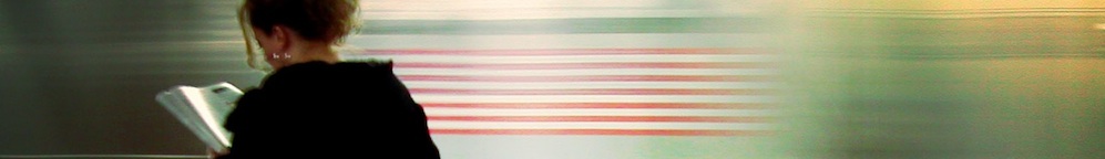
Lookin’ sharp. I take it that’s the KC skyline?
I would have thought my eye would be bothered by the asymetry between the first and third columns (one colored, the other not; one with a dashed separator, the other with none) but it actually works quite well–the column to the far right is functionally part of the blog in a way that the lefthand one is not, and so the different visual styles make sense. It’s well thought out.
Thanks for the feedback, Matt. Yup, that’s the big city. The neighborhood off in the distance behind the word ‘literature’ is where I live.
When both columns were identical, in the original layout, it made the center column look crowded. I played around with some options until I arrived at this one.
Wow! The new layout looks great. Gives me lots of things to think about if I try to modify my template a little (I’m not feeling quite that brave just yet). Really like the addition of the KC skyline in the background.
Totally rad. Really looks nice George. :)
very professional. i like it a lot.
Aw shucks, guys! You sure are swell.
Very smart design, George. Just to add to Matt’s thoughts on the columns: the layout reminds me of architectural floorplans designed to maximize space: a kitchen that opens onto a solarium, a bedroom that opens onto a reading area, where the divisions are created not with walls but by others means. Three-column blogs often look cramped, but the dashed vertical line you’ve used to separate the second and third gives everything a spacious feel.
Thanks, Kari! That’s an interesting analogy, and one that applies to our current apartment, where the kitchen/dining area/living room is one *big* room.